F L A U N T







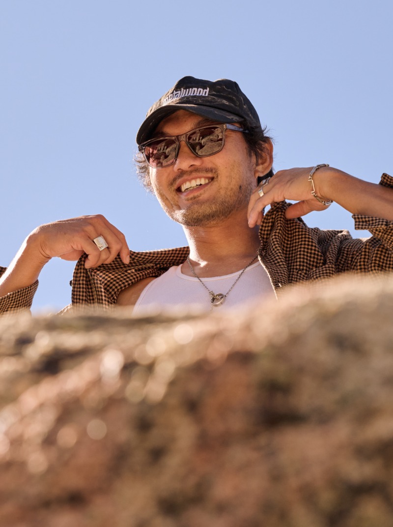




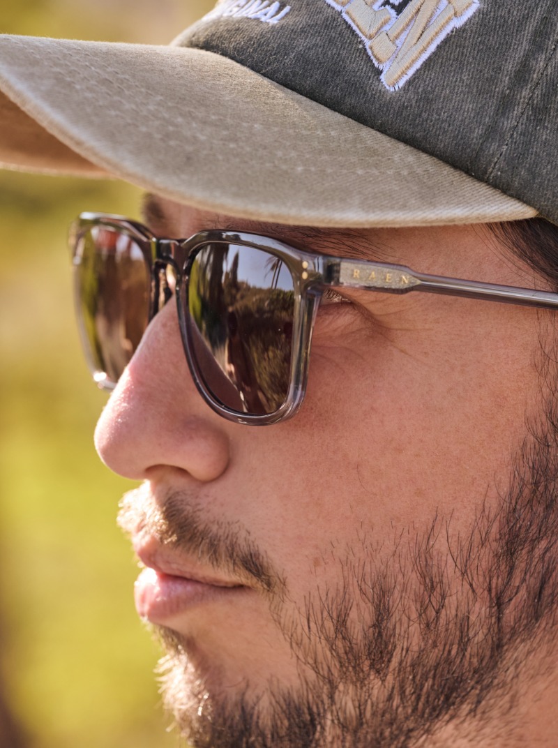
RAEN was born in Southern California and out of the local surf and skate culture where a connection to the ocean and a creative approach to design helped shape the brand from the beginning. Its first storyboards also took in architecture, classic photography and mid-century frames, and while these inspirations continue to drive the design aesthetic nearly twenty years on, the beach is still where the brand begins.
Founders Justin Heit, Jeremy Heit and Jordan Percy grew up surfing in Oceanside. For the Heit brothers, the idea of creating their own eyewear brand had been developing since their youth. When the three came together in 2008, their shared interests and creative backgrounds provided the foundation to bring that vision to life. Justin has said the coolest he ever saw anyone look in a pair of glasses was Bob Dylan. It's a reference that speaks to the brand's appreciation for individuality and timeless style, influences that have shaped RAEN from the start.
It helps to know where each of them came from. Justin came up through surf and skate media, became Nixon’s first art director, and then opened his own design studio, Libre Design, which later took on a complete rebrand of the World Surf League. Jeremy brought the sport itself. He spent years traveling the world as a professional surfer, and his deep knowledge of the surf industry, along with extensive connections across surfing’s widespread community, gave him the unique marketing and sales perspective he has used to build RAEN as co-founder and General Manager since the very beginning. Their longtime friend Percy, who had already established his credibility as Libre’s art director, was the perfect fit to be RAEN’s design director.
What came out of the collective work was a brand built on a strong foundation of restraint. RAEN lets the material, the build and the structure of its glasses carry the design.
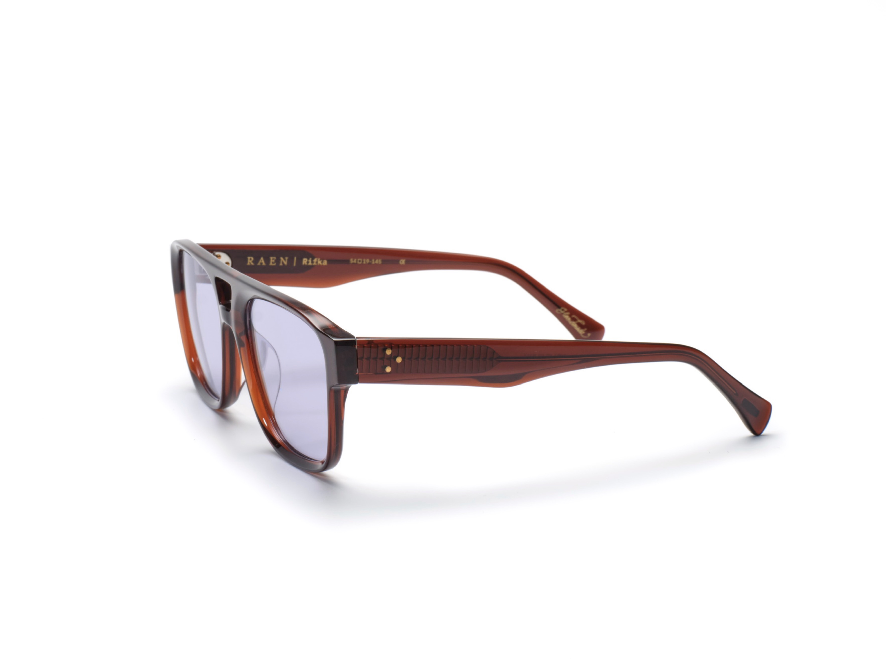
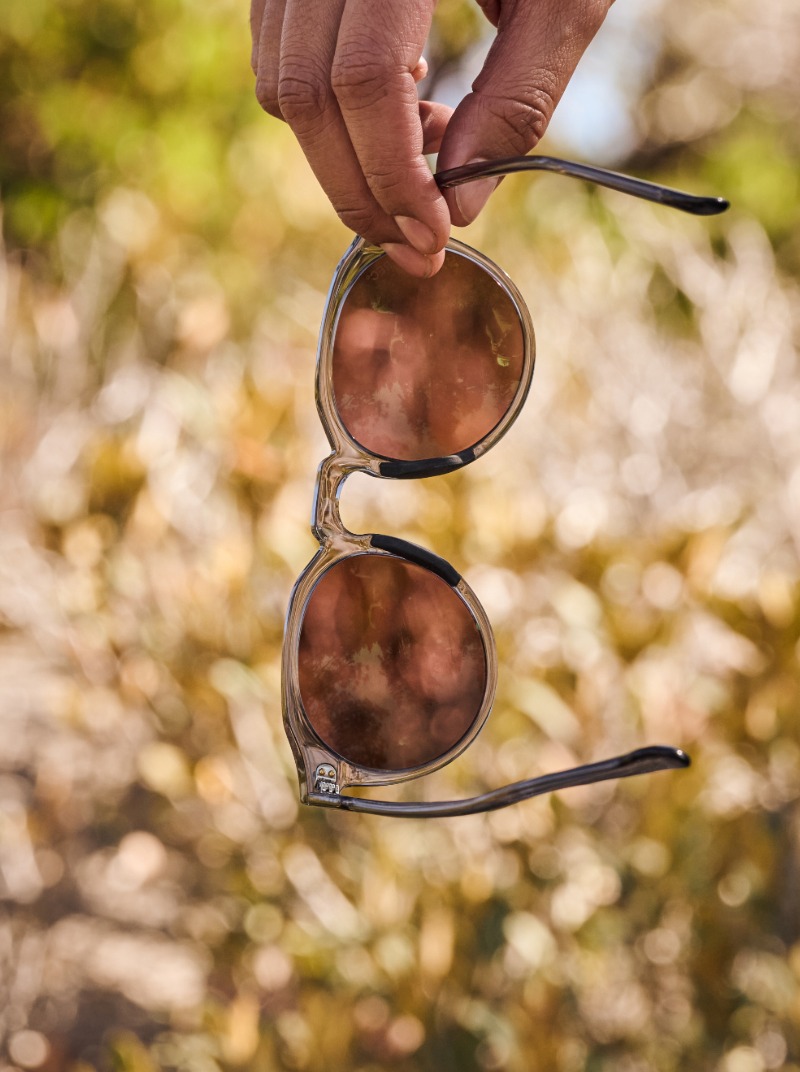
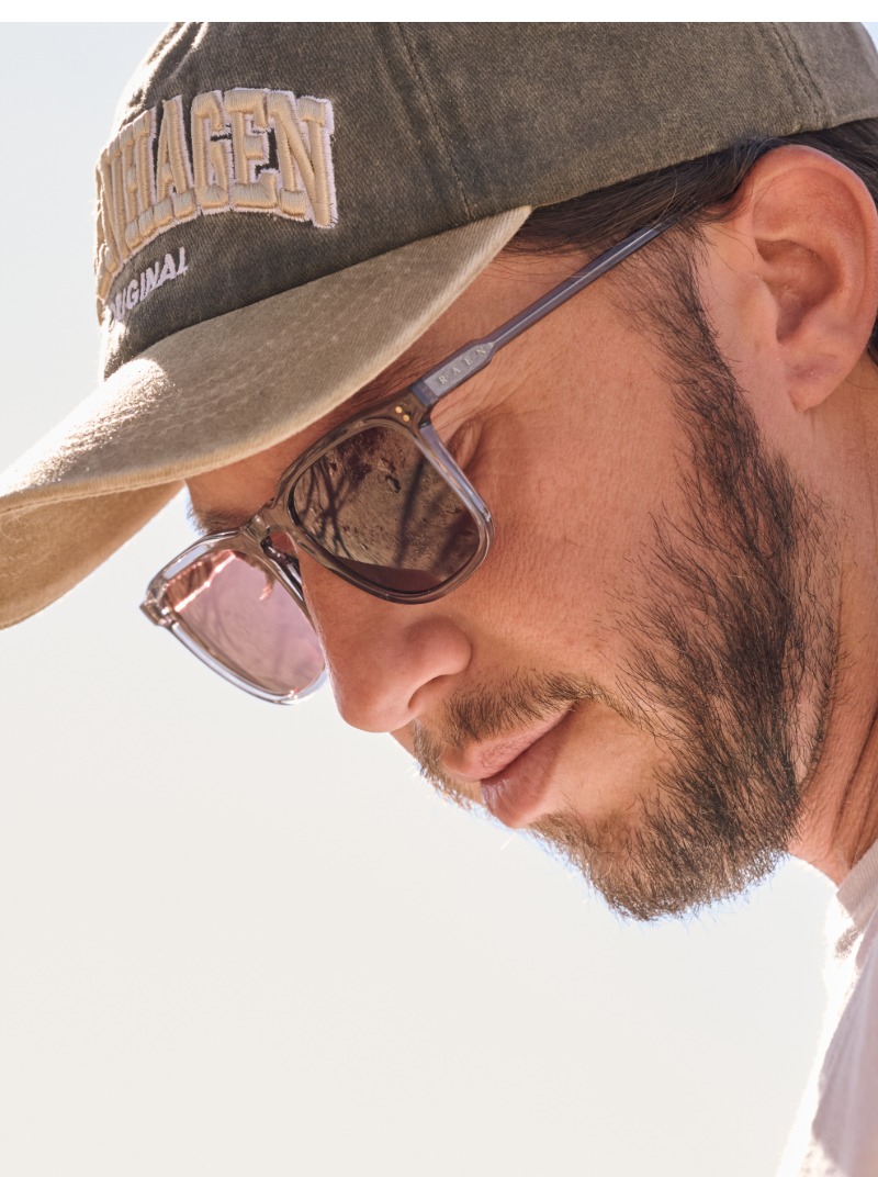
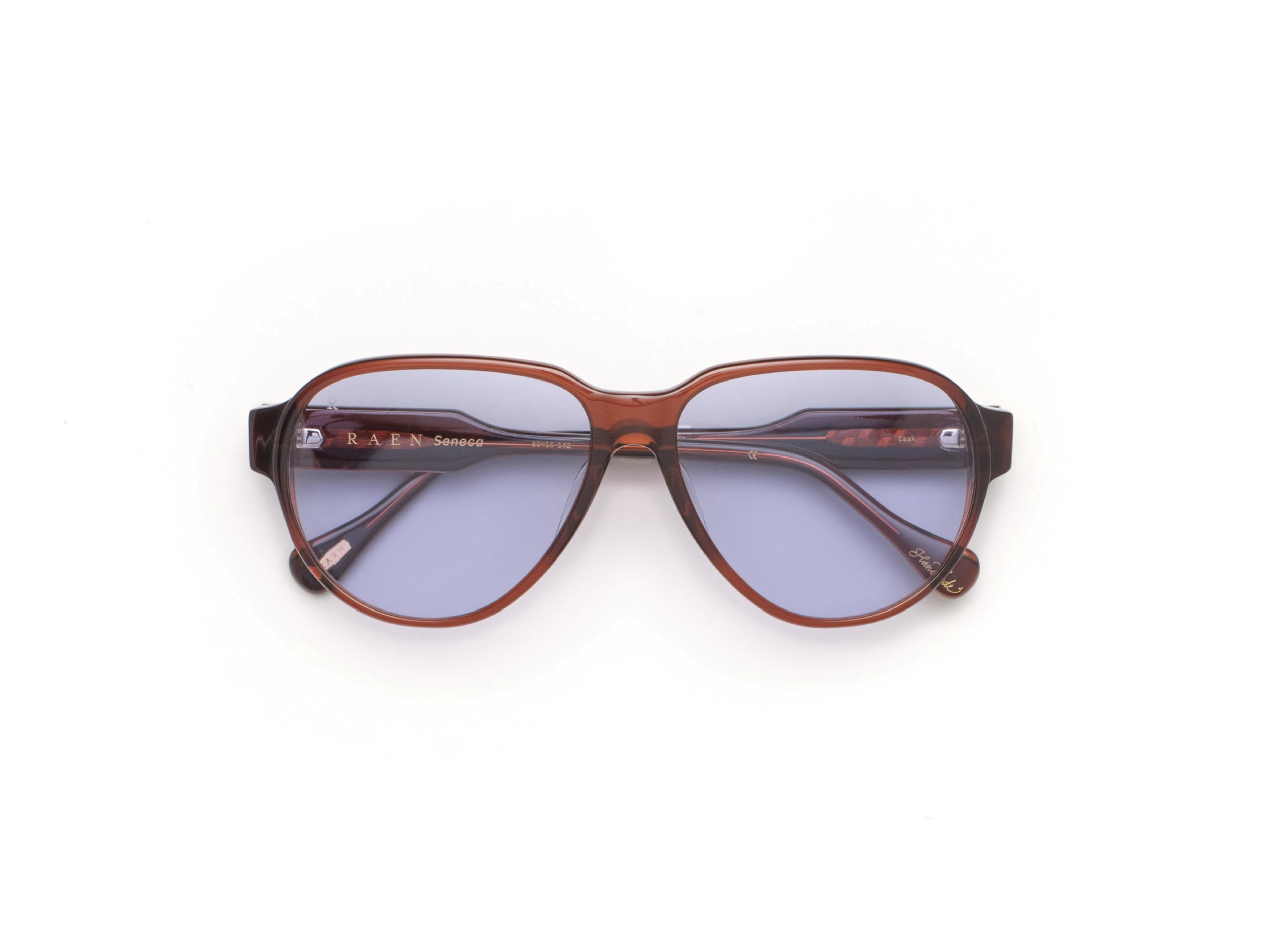
Wearing these glasses never feels like an overcomplicated attempt at a statement, but the quality is obvious, a subtle flex that shows up in simpler ways, like the colors of the frames themselves. The acetates are mixed for RAEN alone and so carefully considered that light goes straight through the rims, which is how you end up with a style like the Remmy (the brand’s bestseller) in colors such as Brindle Tortoise, Honey, Champagne Crystal or Crystal Clear, each frame cut and polished by hand.
RAEN started making eyeglasses in 2013, after friends kept getting prescription lenses put into their RAEN sunglasses, and several of the first styles were named after surf spots. This fall’s optical colors have names like Hearth, Clove, Flint and Glaze, which sound a lot more like a fireside than a shoreline, and one of the new shapes, Ellex, is cut narrow for smaller faces and meant, RAEN says, “to make an impression without overwhelming.” Inside its temples are slim metal cores whose design nods to the brand’s hexagonal logo.
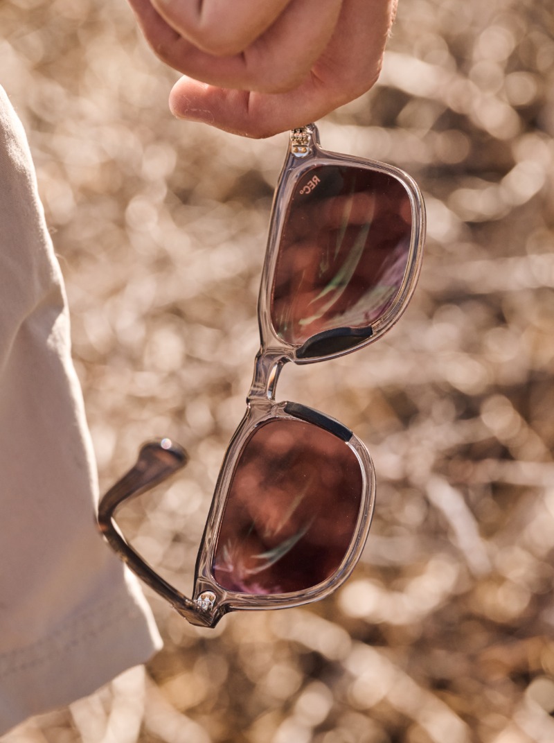
Then there’s REC°, short for Roam, Escape, Create, the sport line RAEN launched in May. The brand calls it “athleisure for your eyes,” and it’s a fair description. The line started with two of RAEN’s own classics, the Remmy and the Wiley, reworked for movement, along with one new shape, the Koen. The reworking happens at the bridge, in the lenses and in the grip pads, which RAEN calls Strata Grip and which are built into the frame, so there’s no extra bulk and nothing that reads as sporty.
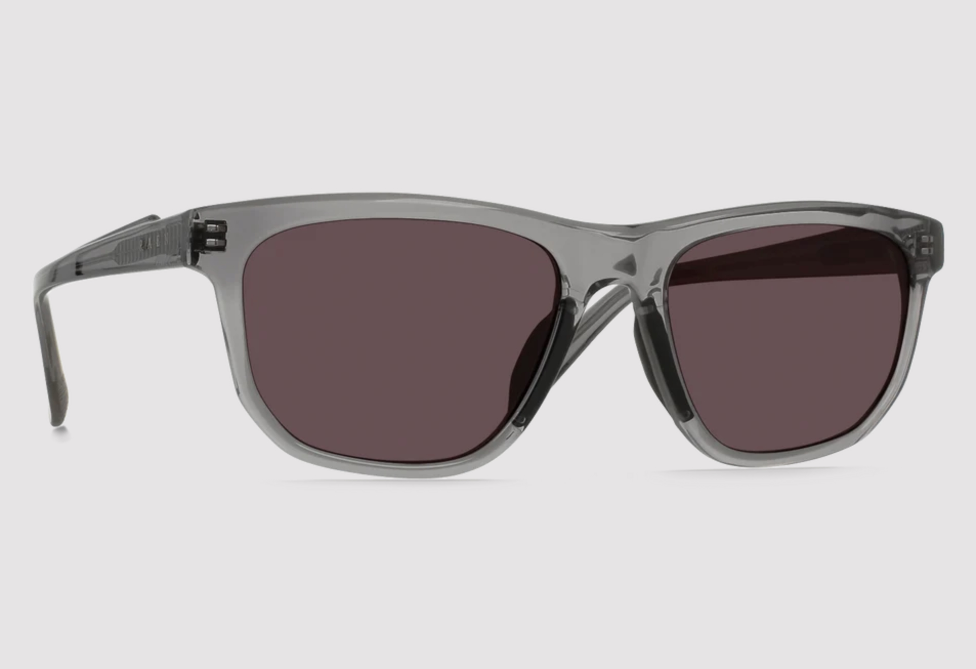
The Koen is the only one that really flirts with athletic eyewear, borrowing the curve of a late-nineties wraparound and squaring it off with a bold, geometric front.
The lenses are where REC° turns into a color story. RAEN uses a polarized lens featuring patented Colorboost technology designed to sharpen color and contrast. Each lens is built on a base tint matched to a particular kind of landscape. Drift is a bronze made for the water, Terra a neutral smoke for desert glare and long drives, Vector a green for golf courses and open fields, and Crux, the newest of the four, a rose tint for snow and rock. You pick one the way you'd pick a jacket, for wherever you're headed, each reflecting a different environment while staying true to the brand's California roots.
The finest detail in the whole line is one almost no one else will ever see. Etched into the temple tips of every REC° frame, the part that spends all day tucked behind the ear, are topographic contour lines, the kind you’d find on a hiking map rather than a nautical chart. The shape belongs to everyone else, the map belongs to whoever’s wearing them, and it usually only turns up at the end of the day, when the glasses finally come off.
Stay up-to-date with exclusive events and content.


