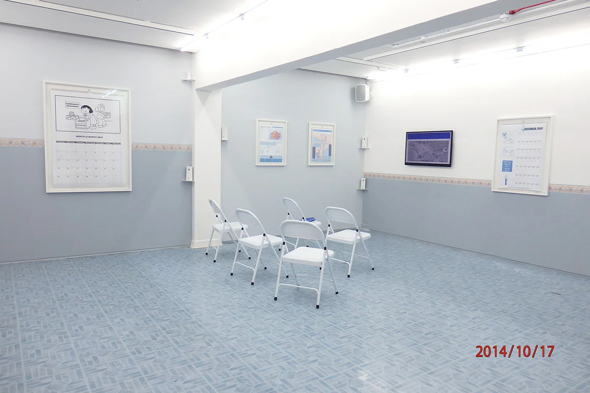
Exhibition View, the Destruction of Experience, (2014). Courtesy the Artist.
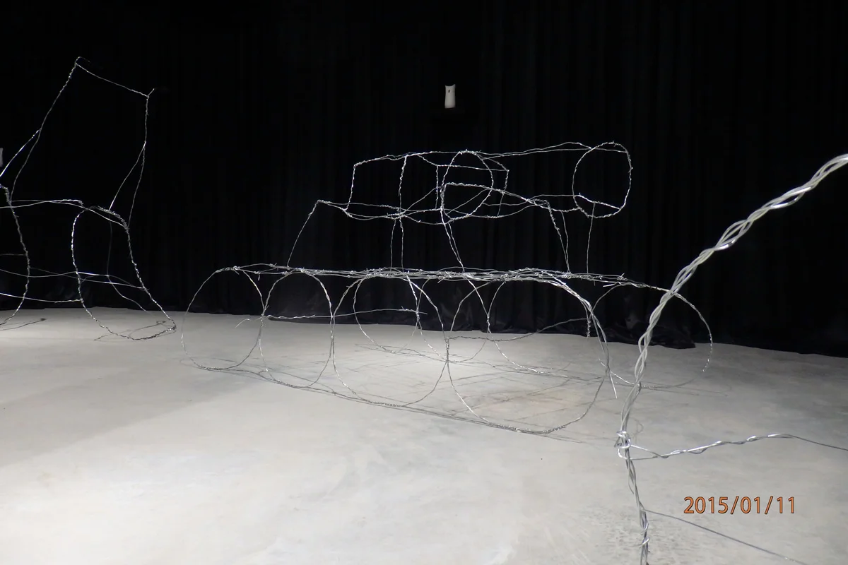
Exhibition View, Stock Images of War, (2015). Courtesy the Artist and James Fuentes Gallery, New York.
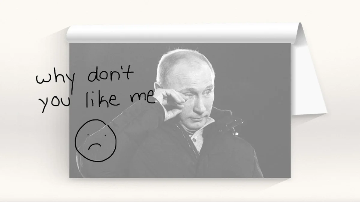
Still From “The Annals of Private History,” (2015). Hd Video With Sound. Dimensions Vary. Courtesy the Artist and Arcadia\_missa, London.

“Stock Images Of War (Hospital),” (2015). Aluminum. Dimensions vary. Courtesy Kunsthalle Mainz, Mainz, Germany.
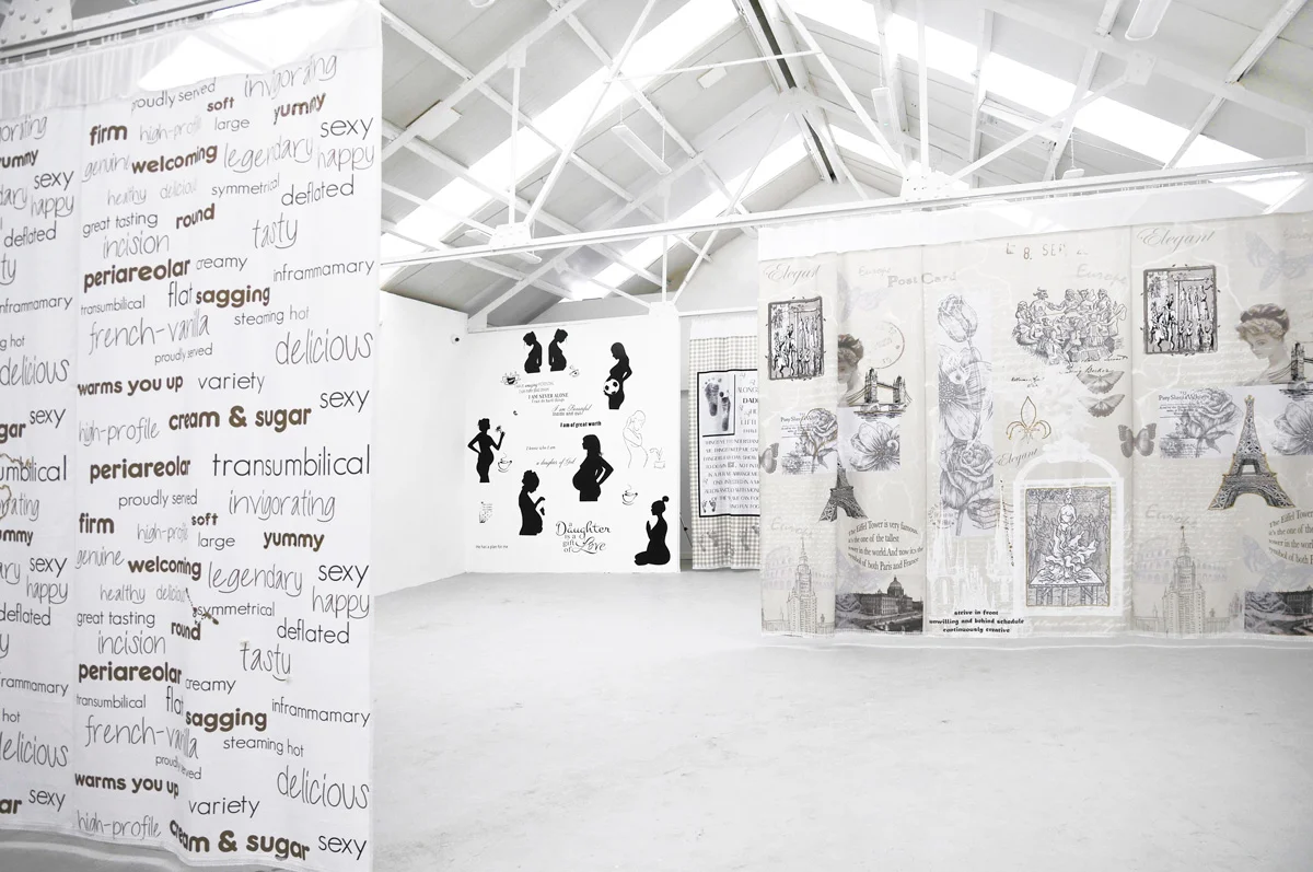
Exhibition view, Babyfootprints Crowsfeet, (2014). Materials unknown. Dimensions vary. Courtesy the artist.
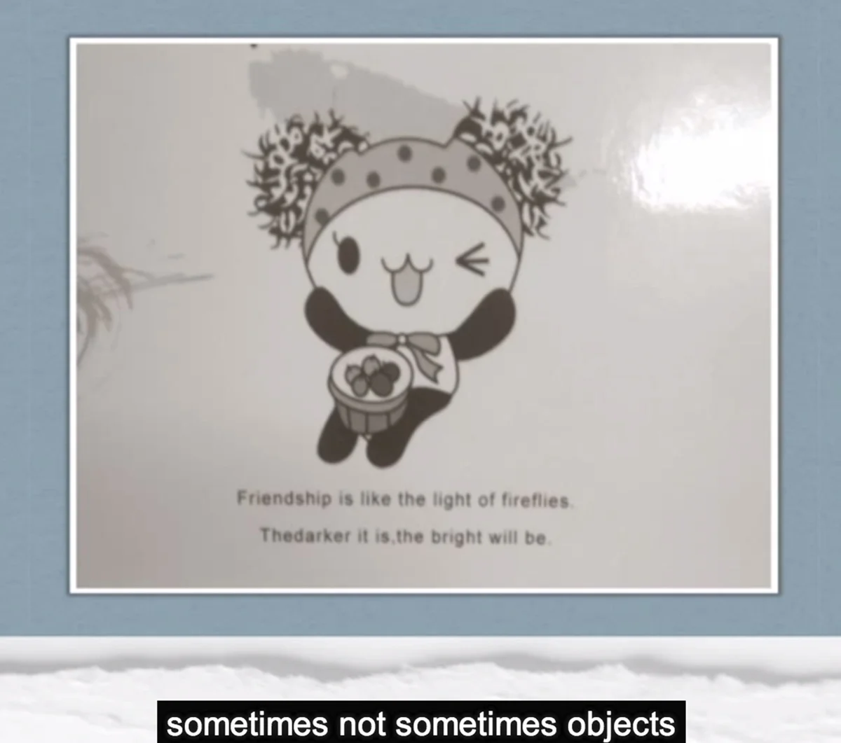
“Buyer Walker Rover,” (2013). Video Essay. Dimensions vary. Courtesy the artist.
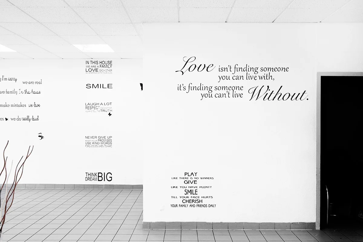
Exhibition view, Promise a Future, (2013). Courtesy the artist and Marbriers4, Geneva.

“Stock Images Of War (Hospital),” (2015). Aluminum. Dimensions vary. Courtesy Kunsthalle Mainz, Mainz, Germany.
[](#)[](#)
Amalia Ulman
This Reality Is a Fantasy Is Not a Test
Somewhere between Chris Burden and Cindy Sherman, artist Amalia Ulman is a fearless investigator of popular culture who is unafraid to use her own body as a critical tool. Her much-lauded 2014 series Excellences and Perfections involved a five-month Instagram performance wherein Ulman took on the persona of an ingénue in search of stardom—a revival, perhaps, of Naomi Watts’s character in the David Lynch classic _Mulholland Drive_ (2001). What Ulman points to that Lynch did not is the “realities” of extreme plastic surgery culture, something that might have changed the haunting story of Betty, Diane, and Rita entirely.
Ulman, never one to be limited by a single medium, has also worked prolifically in illustrated lectures (including one focused on Justin Bieber’s changing relationship to masculinity, as evidenced by his forehead), video, and sculpture. \[See this issue’s cover art: “Ami & Bob: Office Adventures,” (2015).\] No matter her process, Ulman always unites accessibility with nuance, a powerful combination that reminds us of the pressing questions inherent in the minutiae of everyday life. She brings the importance of self-narration to the fore, a privilege that is denied to some, even in the supposedly democratic landscape of social media. For instance, in her recent collaboration with Gucci, Ulman takes a selfie in a store window, subtly showcasing the new #GGBlooms clutch. Ulman turns this commonplace act into a strange one by including an anonymous woman with her back turned as she waits impatiently for the light to turn at the intersection. This scene, in the tradition of René Magritte and his fellow Surrealists, illustrates the unsettling details in the mundane. We ponder the identity of Ulman’s anonymous co-star even as we consume her image without permission. In January of 2016, Ulman will feature in a group exhibition entitled Electronic Superhighway at Whitechapel Gallery, London. She will debut her performance of “Performing for the Camera” at the Tate Modern, London, in February 2016.
#### **When I was looking at your work, I wondered about your historical influences. There’s a tendency when it comes to new media art, especially when it deals with feminist and queer issues, to position it as entirely contemporary and new. Immediately what came to my mind was your relationship to Pictures Generation artists like Cindy Sherman and Marilyn Minter.**
To be honest, I try my best to not look at other fine artists. I consume culture constantly. I’m addicted. So much of everything I consume every day is from music, advertisements, books, graphic design, etc. I have no fine artists who I follow closely. I try my best to be educated, but most of my inspiration comes from cinema and literature. For example, one of my favorite movies is _Barcelona_ (1994) by Whit Stillman. I go back to it to feel inspired. Another favorite is _The Taste of Tea_ (2004).
#### **What kinds of imagery are you drawn to?**
I steal a lot of aesthetics from hospitals, waiting rooms, and offices. These are places I’ve been surrounded by over the past few years. Their neutral or normalized aesthetic is so foreign to me, so I pay attention to the details. What does it mean to be normal? For example, I am very aware of how, institutionally, white people are stealing black or working-class aesthetics or engaging in Orientalism. I still feel like an outsider, which is, for example, why _Barcelona_ is one of my favorite movies, because it appropriates white aesthetics. That’s why I started appropriating _New Yorker_ cartoons. All of these white aesthetics are foreign to me. It’s also interesting to appropriate upper-class aesthetics instead of the other way around—a white person appropriating the lower class. I find that funny, because it’s not my background. It’s like that scene in _Barcelona_ where Ted dances with _The Economist_. Political cartoons, _The Economist_, the _New Yorker_—all these things are so white and lame and, not untouchable, but no one is interested in playing with them because they are so bland and visible. It’s like looking at the details in a waiting room—how the walls are painted with pale colors, for instance.
#### **To pick up on this focus on details, it seems that your work—perhaps epitomized by your show at James Fuentes Gallery in New York—often engages with in-between spaces, places that are ephemeral, where social norms are created and destroyed.**
Exactly, it’s this supposed neutrality right before the moment of revolution—this moment where you point out something that is taken for granted. Then it becomes no longer taken for granted. That’s why I like playing with things I still find gross or disgusting. It’s more difficult. There are so many things that are aesthetically pleasing, because your eye has already adjusted to them. I’m interested in things that are still not bad enough, not gross enough, things that are not really there. For example, I filmed a porno for a show at MAMA Rotterdam called International House of Cozy. I’m interested in how the Pinterest aesthetic can slowly become super tacky. How do I play with these things that are not obvious enough yet, because they haven’t been exploited by the mainstream? It would be too easy to go for something that I already like. I try to choose things that I have a difficult relationship with. After a moment of thinking, this is bland or gross or annoying, I can say, “Now you’re mine!”
#### **That’s so important, because it’s exactly how racism, sexism, and homophobia operate. They become so silent and normalized that they cannot be critiqued. A great example is your online Justin Bieber lecture, The Future Ahead. You unearth something that is so pervasive and ubiquitous and obvious, but you’re showing how insidious it is.**
Yes, I was reading _The Beauty Myth: How Images of Beauty Are Used Against Women_ by Naomi Wolf. In one chapter, she discusses anorexia, but she writes everything using “he” instead of “she.” If you read it from a male perspective, you think, how intense and outrageous! Then she reveals that all of the statistics she cited are from women. Why does it sound so crazy when it’s men, but if it’s a girl who goes to college and starts starving herself, it sounds normal. This also happens with race. If you write about things as if they apply to white people, people say, “Oh, that’s not right!”
#### **It becomes an exercise in how to look into a problem without turning it into pathology. Where is the line between investigating these issues and reinforcing them?**
That was something I was very, very scared about when I did the Instagram performance. I know that the girls who followed me actually did follow me. I saw them being influenced by my performance and I began to wonder about the impact of me behaving like that without explaining what was going on. I rushed myself as soon as the performance was over to be as public as possible. I’d give lectures and talks and try to wrap it up and explain everything, but it was really hard. It is the risk you have to take. In other cases, though, I think this is avoidable and should be. I try my best to not be cynical or too ironic. People go wrong with performance when they start to laugh at other people. Excellences and Perfections was about the performativity of gender, not saying anything is right or wrong, because that doesn’t exist. That’s something I find annoying; just because you’re doing a critique of something, people think you’re snobbish.
#### **Right, when performance gets integrated into the art world, it can become an elitist game of “Look how progressive and aware I am!” However, in your work, you have a really educational side that brings people into the conversation.**
Most of the things I do come out of genuine interest, not a place of irony. I often end up loving what I’m working with. All these things I think of as ugly come out as very beautiful. Otherwise, it would be horrible if I hated what I work with! It is so important that art comes from the heart.
